Data Reconciliation
Manual, spreadsheet-based reconciliation. Real financial and compliance risk. No in-app feature to replace it.
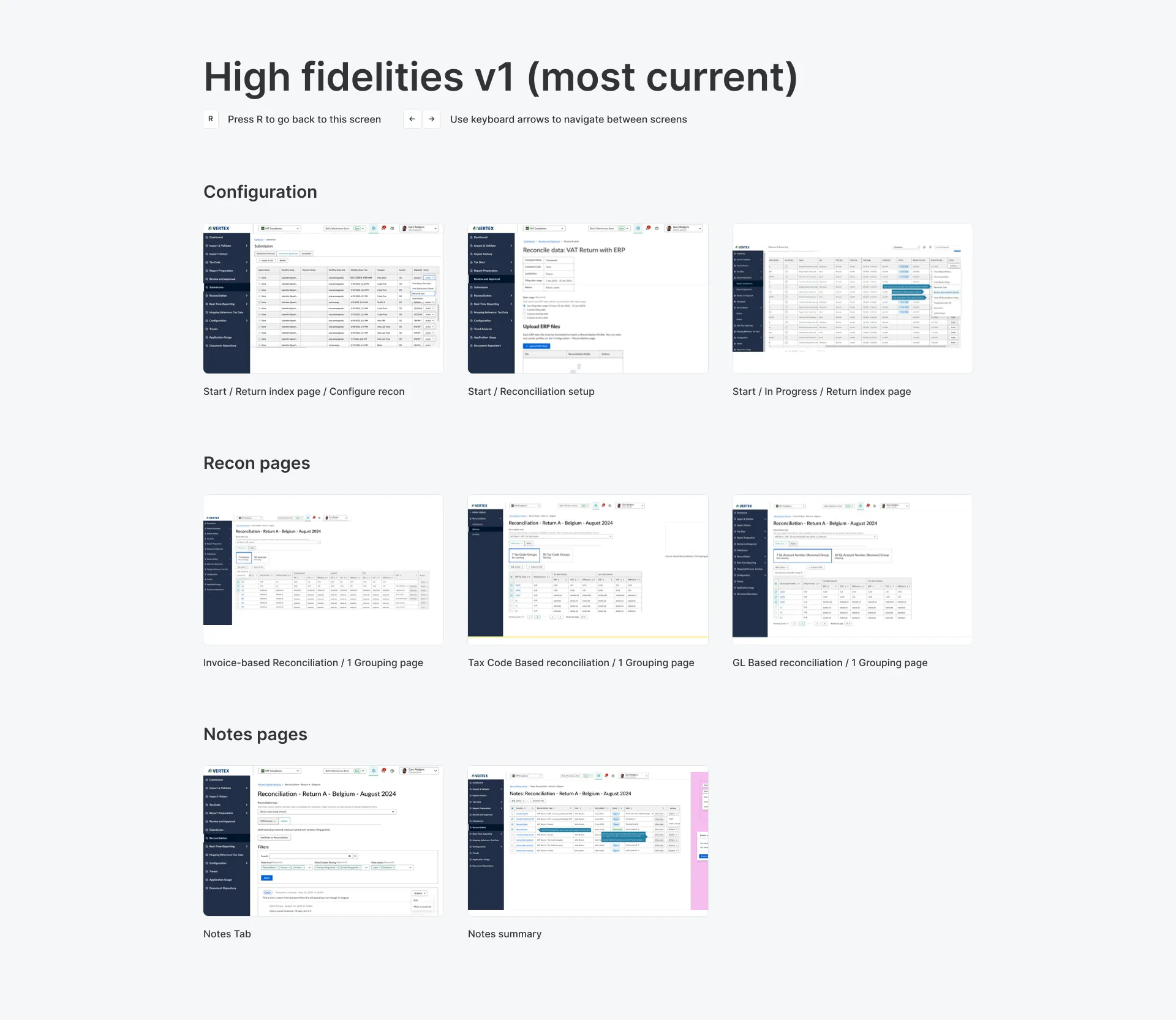
A ground-up reconciliation flow, built from SME research and documented for five parallel engineering teams.
Shipped and in active use. Records stay consistent across systems, at scale.
The Problem
This was my first exposure to reconciliation as a domain, and the volume and complexity of data involved went well past a typical feature scope. Before I could design anything credible, I had to actually understand it: how reconciliation worked, what other ERP systems in the space could and couldn’t do, and where our product’s data model diverged from expectations shaped by those other tools.
Before this existed in the product at all, accountants did it by hand: downloading a CSV from the bank and another from us, then comparing the two themselves, almost entirely in Excel, with custom-built macros if they were more technically inclined. That’s a far more intense process than having the product do it for them, and it’s the baseline this design had to replace.
The stakes were real, too: unresolved discrepancies could create financial exposure for customers, and depending on their industry, compliance exposure alongside it. The design had to earn trust, not just look coherent.
The Business
Vertex needed customers confident enough in reconciled numbers to keep relying on the product for exactly the kind of scrutiny-heavy work reconciliation exists for. A design that looked clean but couldn’t be trusted would have made the underlying problem worse, not better: the business goal and the user goal were the same goal, get people to trust the numbers.
It also had no existing solution to build on: reconciliation was a hugely important part of accounting, and the product had nothing in-app for it yet, so this was a ground-up build, not an iteration. One requirement surprised me: margin of error itself needed to be flexible. Some companies wanted every penny accounted for; others were fine writing off up to some dollar threshold; some thought in percentage of error, others in flat dollar amounts. That wasn’t something I would have designed for without asking.
Research & Approach
I mapped specific flows through the reconciliation process and annotated them with research notes instead of working from assumptions. The domain surfaced enough edge cases that user interviews alone weren’t going to cut it, so I tested and confirmed my understanding directly with subject matter experts. This feature spanned multiple sprints, quarters, and teams, so I built documentation as I went, specifically so ownership could move between people and phases without losing consistency along the way.
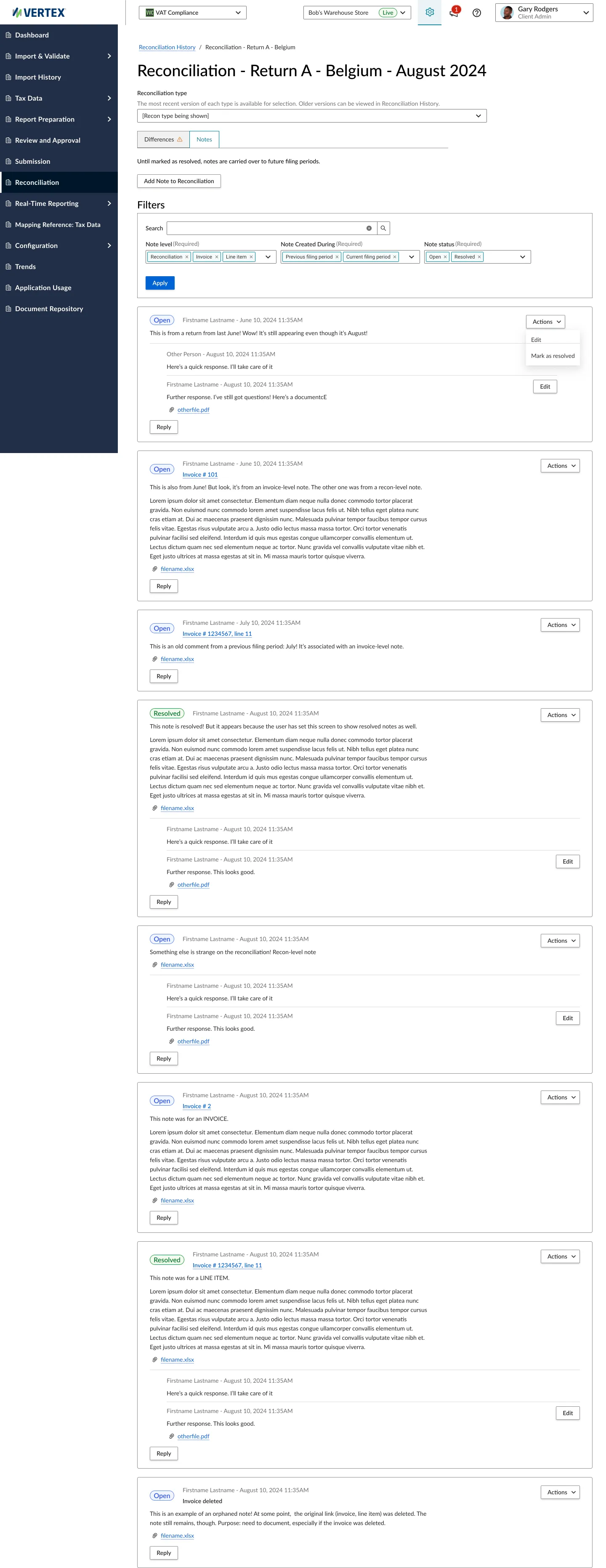
That research surfaced needs past the obvious ask to just “let people fix mismatches”: people needed visibility into where a discrepancy actually came from, not just confirmation that one existed; they wanted a way to leave notes so decisions carried over to whoever picked up a record next; and enough of the process was still manual that automating pieces of it would have mattered more than any redesign of the screens around it.
Users
Accounting teams using this ranged from a single person doing everything to large, structured departments, so I made sure to research and interview across that whole range rather than assuming one shape of team. They varied just as widely in the time they had available to work on reconciliation, whether they ran any kind of approval process before finalizing numbers, and how deep their own domain knowledge of reconciliation went.
Constraints
The product’s existing data model was itself a constraint: it had already diverged from what other ERP tools assumed, so the design couldn’t be the textbook reconciliation flow in the abstract. It had to reconcile against what the product already stored and how it was already structured.
The Solution
The final design let users work accurately within the reconciliation flow and adjust records so data stayed consistent across systems: the core requirement, given that most of the friction came from systems disagreeing with each other in the first place.
Outcome
Shipped and in use today. The design gave users visibility into where a discrepancy actually came from, a way to leave notes and track decisions as a record moved between people and phases, and a workflow built to scale across the multiple quarters this feature ultimately spanned, rather than needing to be rebuilt each phase.
That documentation discipline mattered more than usual because of how the engineering side actually played out: at its peak, five separate engineering teams were working on this at once. Without a clear, shared record of decisions and where each phase stood, that much parallel work could easily have pulled the feature in inconsistent directions.
Reflection
Looking back, I’d have pushed for usability testing earlier instead of leaning as heavily on subject-matter-expert validation, and pushed harder on automating the manual parts of the process itself, not just the screens around it.
Ramping into ERP systems from zero, and learning to document for a long, multi-team timeline, turned out to matter well beyond this one project. When a related reconciliation problem showed up again later, I moved faster and pushed further, because I already knew to look one layer beneath the stated problem.